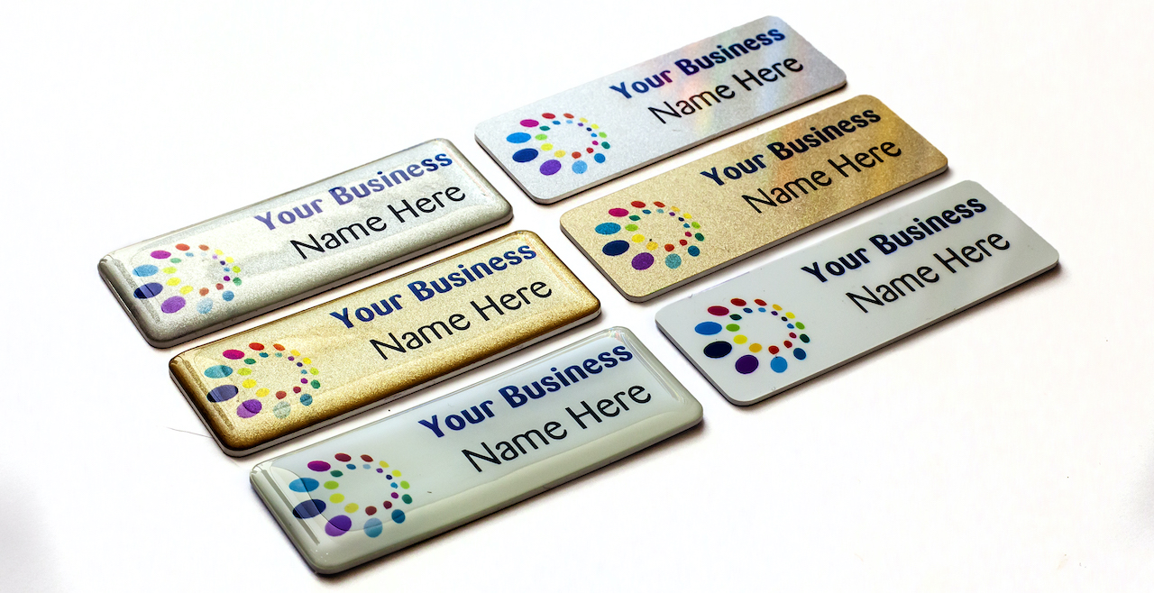
Name Badges - Design Tips for an Impressive Look
Name badges are essential for your company or organization's ID system. The primary function of this badge is to show the name of each person working in your organization. Designing an impressive-looking name badge is essential to establish a positive image for your company or organization.
Name Badges - Design Checklists
How can you make your custom metal badge stand out? First, focus on simplicity. Second, add a unique touch to your name badge design. Follow these checklists:
• Simplicity
Creating a simple name badge is preferable to avoid making too many distractions in the design. You only need to focus on highlighting the name of the badge wearer. The design should not distract from this focus.
• Unique touch in Name Badges
You can add a unique touch to your simple design, such as a specific border style or a distinctive shape. It helps make the name badge stand out from the generic ones. However, you can keep the additional design element subtle and not too dominant for the overall design.
• Material of Name Badges
A high-quality material will be preferable to keep the name badge looking professional. You can choose a metal-based name badge to allow for long-term usage. Metal materials will also provide better durability and protection from scratches.
• Font
Some fonts won't be a good candidate for your name badge. It's best to pick the one that is readable from a distance. Use a high-quality resolution for your name badge, making the font look crisp and clear.
• Information in Name Badges
Don't include too much information in your name badge. Add only essential information, such as name, occupation, and company logo. Use an ideal placement for each information you add to the badge.
Follow these design checklists to make the best name badge for your organization. It will provide the sleek design and professional look you need to establish a good reputation. Keep your name badge appropriate for your organization by making a unique design that carries your company's best image.
Name Badges - Things to Avoid

• Intricate font
There are thousands of fonts you can use for the name badge design. Some fonts are so intricate or artsy that you can't read them easily. Use only fonts that are not difficult to read from a distance, with no complicated design.
• Bright colors in Name Badges
Using bright colors can be distracting for your name badge design. Low contrast will also make the name more difficult to read. It is best to use simple colors that are not too bright while providing high contrast between the text and the background.
• Crowded design
Too many design elements can be distracting for your name badge. Also, it will crowd the nameplate itself and create a less aesthetically appealing design. You can limit the design elements to three or fewer to avoid making a crowded or distracting design style.
Contact Us
The name badge is an essential identifier for the individuals working in your company or organization. It's always a good practice to keep your name badge clean, elegant, and professional-looking. By following the design checklists and things to avoid, you can make an impressive-looking name badge for your organization. Contact us today!
Next News: Hard Enamel Metal Badges


.png)
.png)
.png)
.png)